Form Navigation
The Navigation settings in Endatix Hub allow you to fine-tune the respondent's journey. By adjusting how navigation elements are positioned and what information is visible, you can create a more intuitive experience that reduces form abandonment.
These settings are particularly important when balancing the need for simplicity - using features like "Auto-advance" - against the need for data accuracy, such as providing a "Review before submit" stage.
Some form navigation options are dependent on the form's display mode.
Configuration Guide
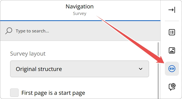
To access these settings, select the Navigation icon in the Property Grid.
Navigation Buttons
This section defines the core interactive elements and visual indicators that guide a respondent through your form. You can control where navigation buttons appear and whether users can go backward.
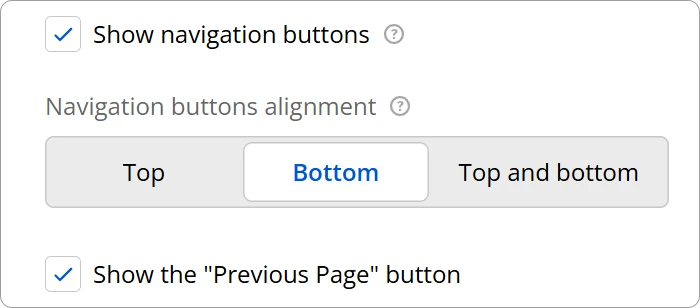
- Navigation buttons alignment: Select where the main navigation controls (Next, Previous, Complete) are positioned on the page. Options include Top, Bottom, or Top and bottom.
- Show the "Previous Page" button: Toggle this to allow or prevent respondents from returning to earlier questions to review or change their answers.
Button Text Customization
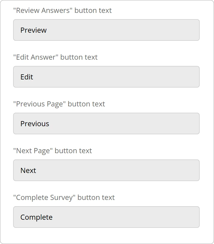
Every navigation button's text be customized to better fit the use case of your form.
| Label Field | Default Value | Purpose |
|---|---|---|
| "Review Answers" button text | Preview | The button that triggers the review summary page. |
| "Edit Answer" button text | Edit | The button displayed next to answers on the review page to return to that question. |
| "Previous Page" button text | Previous | The button used to go back to the prior page. |
| "Next Page" button text | Next | The button used to advance to the following page. |
| "Complete Survey" button text | Complete | The final submission button that ends the survey. |
Progress Bar
Enables a visual tracker to show respondents how much of the form they have completed.
The appearance and behavior of the progress bar can be configured through the following properties:
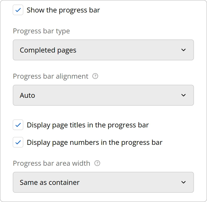
Progress Bar Type
This setting determines the logic used to move the progress indicator forward.
| Option | Description |
|---|---|
| Completed pages | Progress is based on the number of pages the user has navigated through. |
| Answered questions | Progress is calculated by the total number of questions answered vs. total questions. |
| Answered required questions | Only tracks progress based on questions marked as "Required." |
| Valid answers | Progress only advances when questions pass all validation rules (e.g., correct email format). |
Progress Bar Alignment
Defines the vertical placement of the progress bar within the survey interface.
| Option | Description |
|---|---|
| Auto | The system chooses the best placement based on your theme settings (usually top). |
| Above the header | Places the bar at the very top of the survey page, above the survey title/header. |
| Below the header | Places the bar immediately under the survey header but above the questions. |
| Bottom | Places the bar at the bottom of the survey page. |
| Top and bottom | Displays progress indicators at both the top and the bottom for maximum visibility. |
Progress Bar Area Width
Determines the horizontal span of the progress bar.
| Option | Description |
|---|---|
| Same as container | The bar matches the width of the outer page container. |
| Same as survey | The bar matches the width of the survey content area itself. |
Finally, you can use the Display page titles in the progress bar and Display page numbers in the progress bar checkboxes to add extra context to the visual indicator.
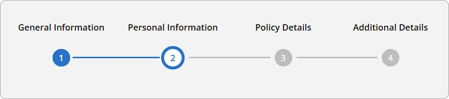
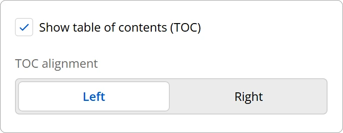
Table of Contents
When enabled, the table of contents will display an interactive list of the form's pages, allowing the respondent to navigate through them.
Review Before Submit
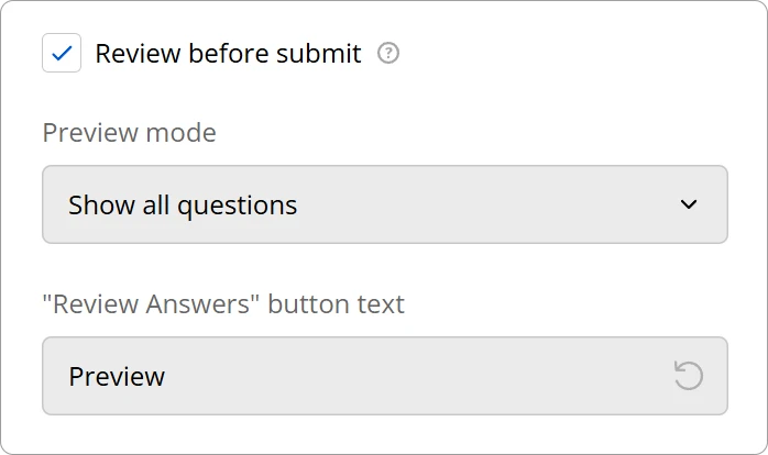
Adds a condensed summary page at the end where users can see all their answers before final submission.
Technical Reference
These settings are stored in the survey JSON under the following properties:
{
  "showProgressBar": true,
  "progressBarLocation": "topbottom",
  "progressBarShowPageTitles": true,
  "progressBarShowPageNumbers": true,
  "progressBarInheritWidthFrom": "survey",
  "showTOC": true,
  "pagePrevText": "Previous Page",
  "pageNextText": "Next Page",
  "completeText": "Submit the Form",
  "previewText": "Preview Responses",
  "editText": "Edit Answers",
  "showPreviewBeforeComplete": true,
  "previewMode": "answeredQuestions"
}
Properties
| UI Option / Label Field | JSON Property | Value / Example |
|---|---|---|
| Show the progress bar | showProgressBar | true | false |
| Progress bar alignment (Top and bottom) | progressBarLocation | "topbottom" |
| Display page titles in the progress bar | progressBarShowPageTitles | true | false |
| Display page numbers in the progress bar | progressBarShowPageNumbers | true | false |
| Progress bar area width (Same as survey) | progressBarInheritWidthFrom | "survey" |
| Show table of contents (TOC) | showTOC | true | false |
| "Previous Page" button text | pagePrevText | "Previous Page" |
| "Next Page" button text | pageNextText | "Next Page" |
| "Complete Survey" button text | completeText | "Submit the Form" |
| "Review Answers" button text | previewText | "Preview Responses" |
| "Edit Answer" button text | editText | "Edit Answers" |
| Review before submit | showPreviewBeforeComplete | true | false |
| Preview mode (Show answered questions only) | previewMode | "answeredQuestions" |