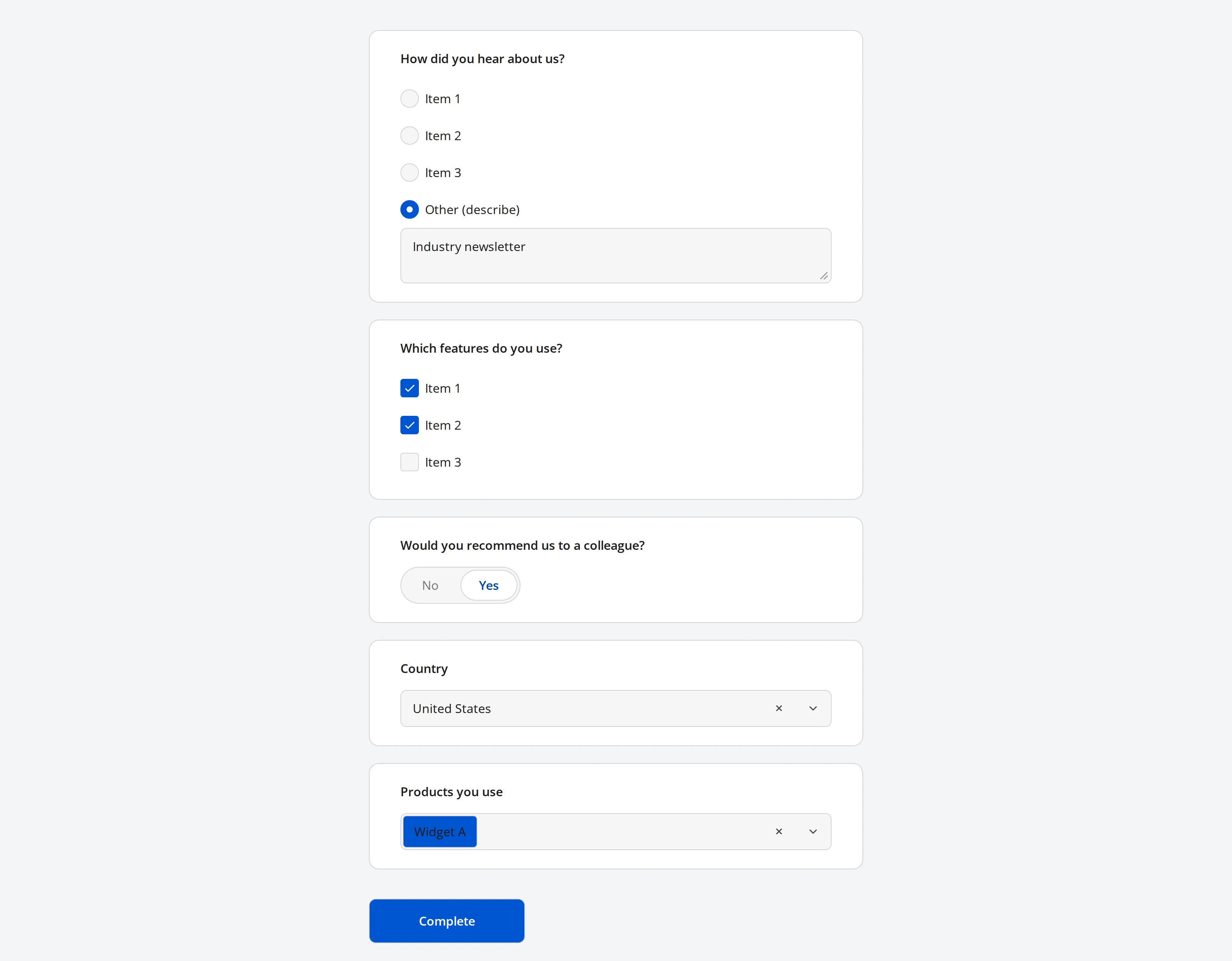
Choice Questions
Endatix Hub has six question types for answers picked from a predefined list: Radio Button Group, Checkboxes, Yes/No (Boolean), Dropdown, Multi-Select Dropdown (Tag Box), and Image Picker. This page covers what they share - editing choices, per-choice logic, "Other", and exclusive choices - and what makes each one different.
| Question type | Selection | What it renders |
|---|---|---|
| Radio Button Group | One choice | A vertical list of round buttons |
| Checkboxes | Any number of choices | A vertical list of checkboxes |
| Yes/No (Boolean) | One of two fixed values | A toggle - segmented control, radio buttons, checkbox, or switch |
| Dropdown | One choice | A searchable dropdown list |
| Multi-Select Dropdown (Tag Box) | Any number of choices | A searchable dropdown whose selections appear as removable tags |
| Image Picker | One or more images (or videos) | A grid the respondent clicks instead of reading text |
Yes/No is a fixed true/false value and has no choice list to edit - see Yes/No (Boolean) below. The other five all use the same Choice Options category on the Property Grid.
Editing choices
Select a question and open its Choice Options category to manage the list:
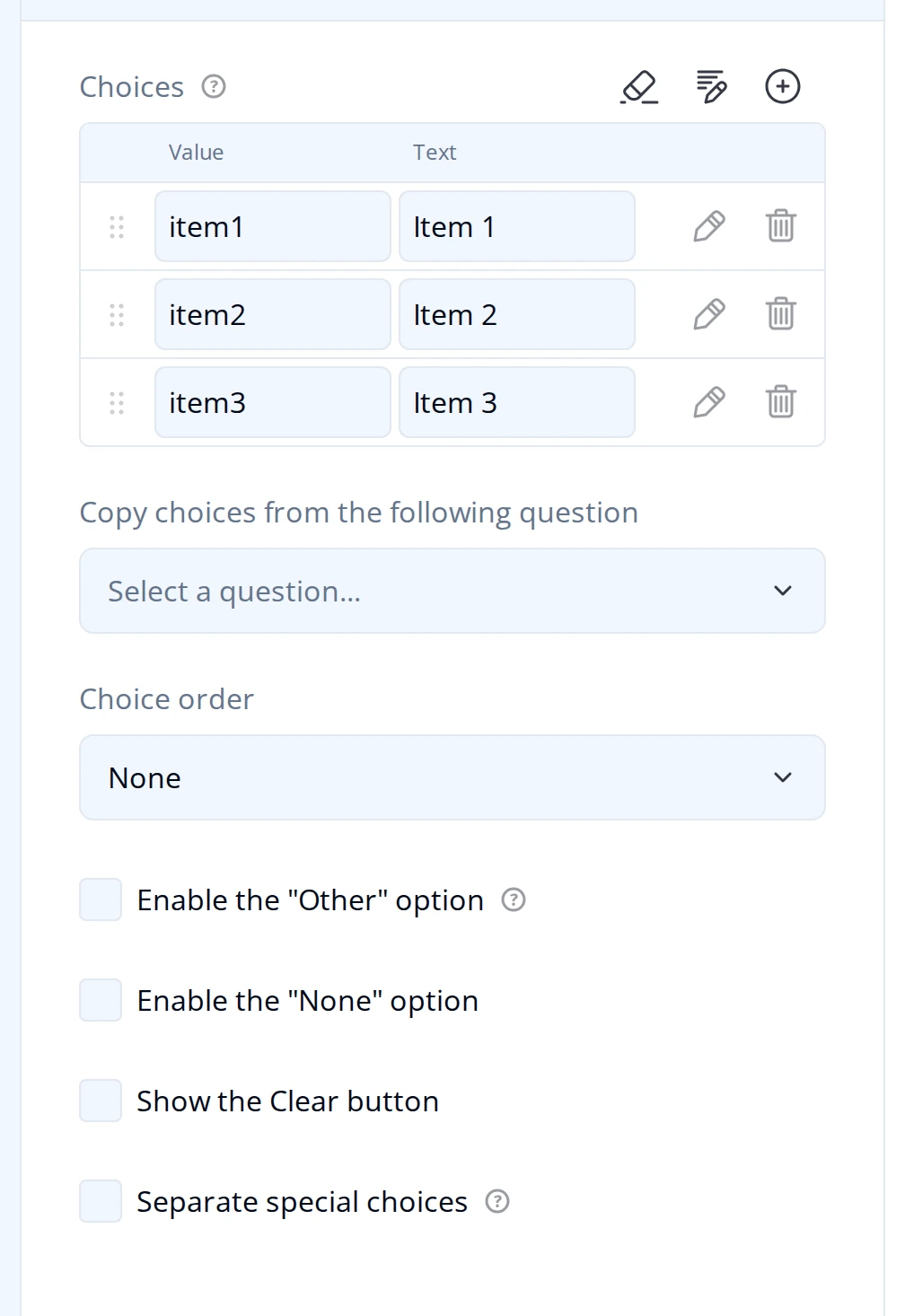
Each row has a Value (stored in the submission) and a Text (shown to the respondent). Drag a row to reorder it, use the trash icon to remove one, and + to add another. The pencil icon above the table opens fast entry: a plain-text box where each line is value|text, for pasting in a long list at once.
Two settings build a list from elsewhere instead of typing it in:
- Copy choices from the following question reuses another question's option list directly. To combine several source questions, choose which of their answers to include, or set a priority between sources, use Carry Forward instead.
- Choice order shuffles the list per respondent. See Randomization of Choices for the full set of options, including grouping choices that should never be shuffled apart.
Dropdown and Multi-Select Dropdown can also bind to a shared, reusable option list instead of an inline one - see Data Lists.
Multi-Select Dropdown has its own Search mode (Contains or Starts with) for the filtering it does as the respondent types. On top of that, Blind Search keeps the choice list hidden entirely until the respondent has typed a minimum number of characters, for unaided-recall scenarios like brand awareness where showing the full list would bias the answer - see Blind Search.
Image Picker's choices are images or videos rather than text - see Image Picker below for how its Choices table differs.
Per-choice conditions and exclusivity
Click the pencil icon on a choice row (its Show Details) to reveal settings for that one choice:
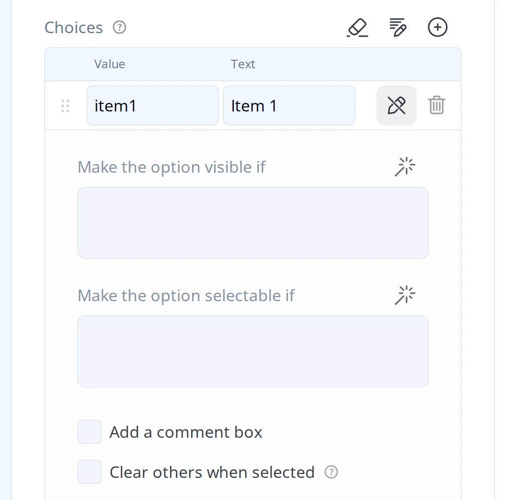
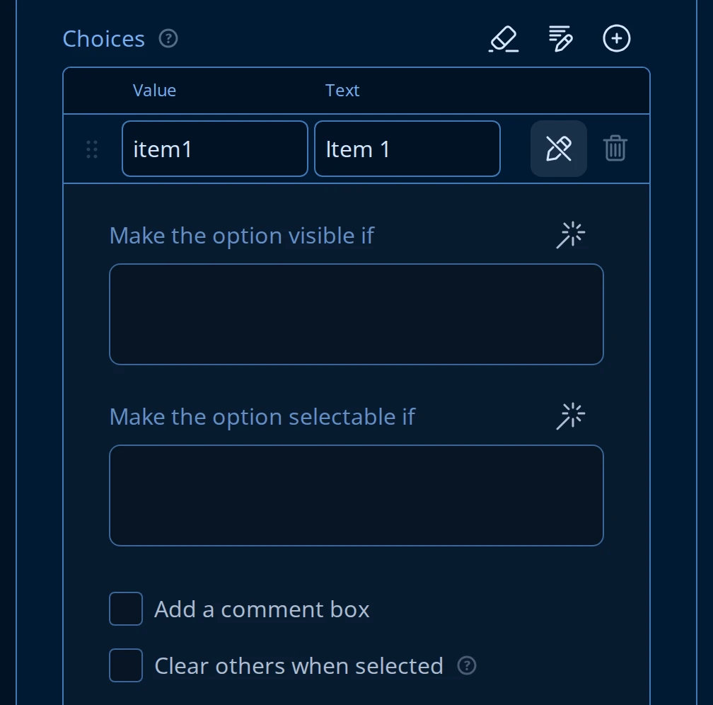
Make the option visible if and Make the option selectable if run the same condition language as the rest of the form - offer or hide a single choice, or let it show but block it from being picked, based on earlier answers. This is the choice-level entry point into Endatix's logic system; for the full reference, including a version that applies one condition to every choice on the question, see Conditional Logic.
Clear others when selected is available on Checkboxes and Multi-Select Dropdown, the two types where more than one choice can be picked at once. Turn it on for a choice like "None of the above": when the respondent picks it, every other selected choice on that question is cleared automatically. It has no effect on Radio Button Group or Dropdown, since picking any option there already replaces the previous one.
"Other", "None", and the Clear button
Back on the question's Choice Options category (not a per-choice setting):
- Enable the "Other" option adds an Other (describe) choice. Selecting it reveals a text box, and the respondent's typed answer is stored alongside the choice. Available on Radio Button Group, Checkboxes, Dropdown, and Multi-Select Dropdown - not on Image Picker or Yes/No.
- Enable the "None" option adds a fixed None choice, for when "none of these" needs to be a first-class answer rather than an empty one.
- Show the Clear button adds a control that lets the respondent blank out their entire answer to the question. Don't confuse it with Clear others when selected above: that one decides what happens to a question's other choices when a specific choice is picked, not how the respondent resets their own answer.
Yes/No (Boolean)
Yes/No collects a single true/false answer. It has no Choice Options category - instead, its General tab has:
- Display mode: Segmented toggle (default), Radio buttons, Checkbox, or Switch.
- Label for "True" and Label for "False", so the two values can read as anything - "Yes/No", "Agree/Disagree", "In stock/Out of stock" - while the stored value stays
true/false. - Swap the order of Yes and No, for when the negative answer should appear first.
Image Picker
Image Picker offers images (or videos) to click instead of a text list. Its Choices table has Value, Alt text, and Image or video file URL columns instead of Value/Text, and starts empty - add each choice by uploading a file or pasting a URL:
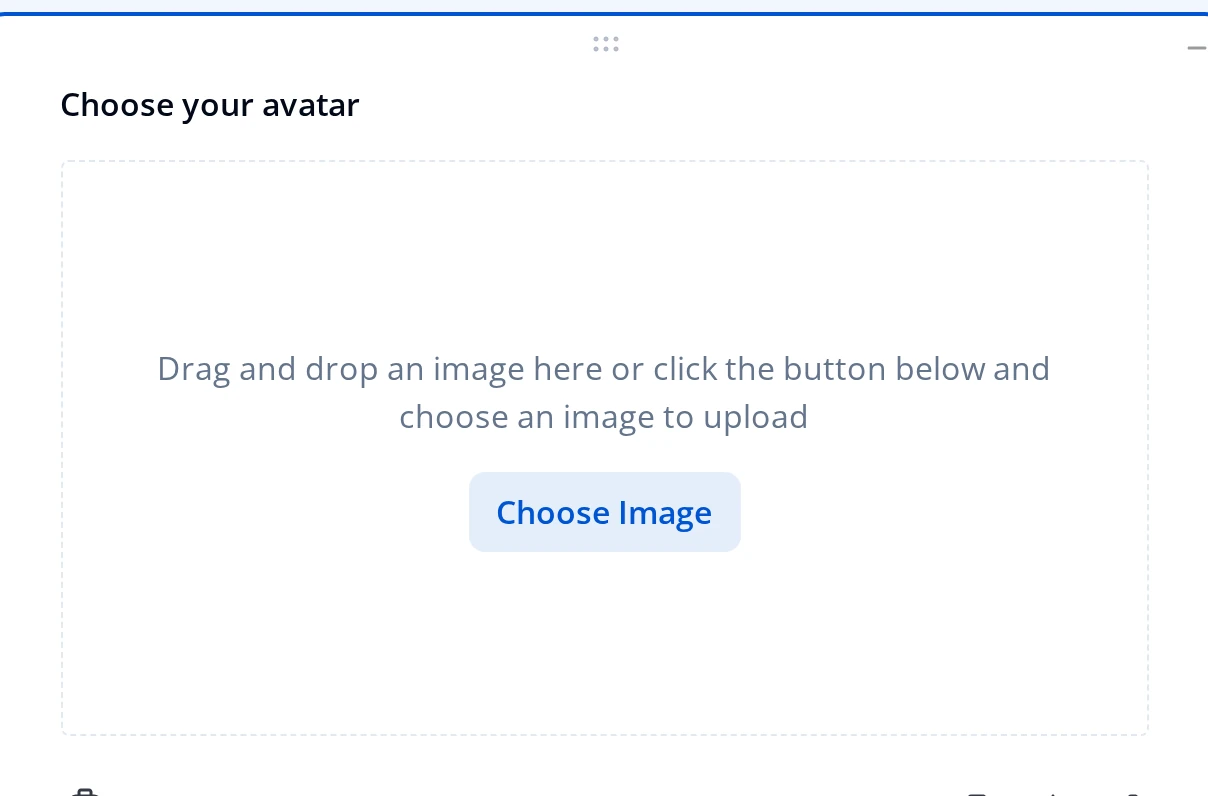
On the General tab, Allow multiple selection switches it between a single pick (like Radio Button Group) and any number of picks (like Checkboxes). Content mode accepts Image or Video files, Image and thumbnail fit controls how a file fills its tile (None, Contain, Cover, Fill), and Minimum/Maximum display area width/height bound the tile size. Per-choice conditions (Make the option visible if / selectable if) work the same as the other choice types above.
What respondents see