Rating and Ranking Questions
Endatix Hub has four question types for scoring, ordering, or sorting a set of options: Rating Scale, Slider, Ranking, and Drag to Categorize. This page covers each one's own settings - rating icons, slider ranges, selective ranking, and drop zones.
| Question type | Answer shape | What it renders |
|---|---|---|
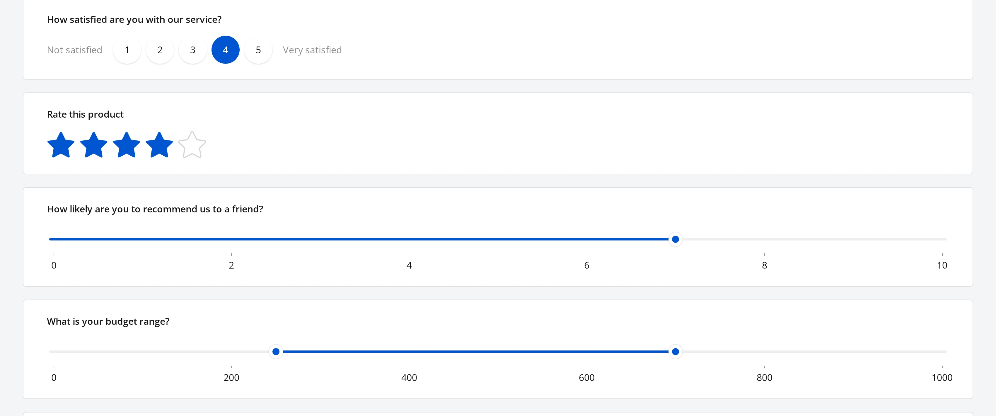
| Rating Scale | One value from a fixed scale | A row of numbers, buttons, or icons the respondent picks one of |
| Slider | One value, or a range, between a minimum and maximum | A draggable handle (or two, for a range) on a track |
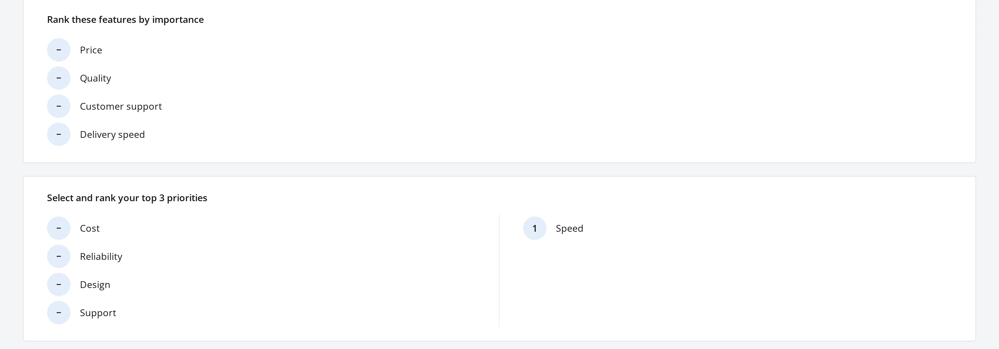
| Ranking | Every choice, in respondent-chosen order | A list the respondent drags into order |
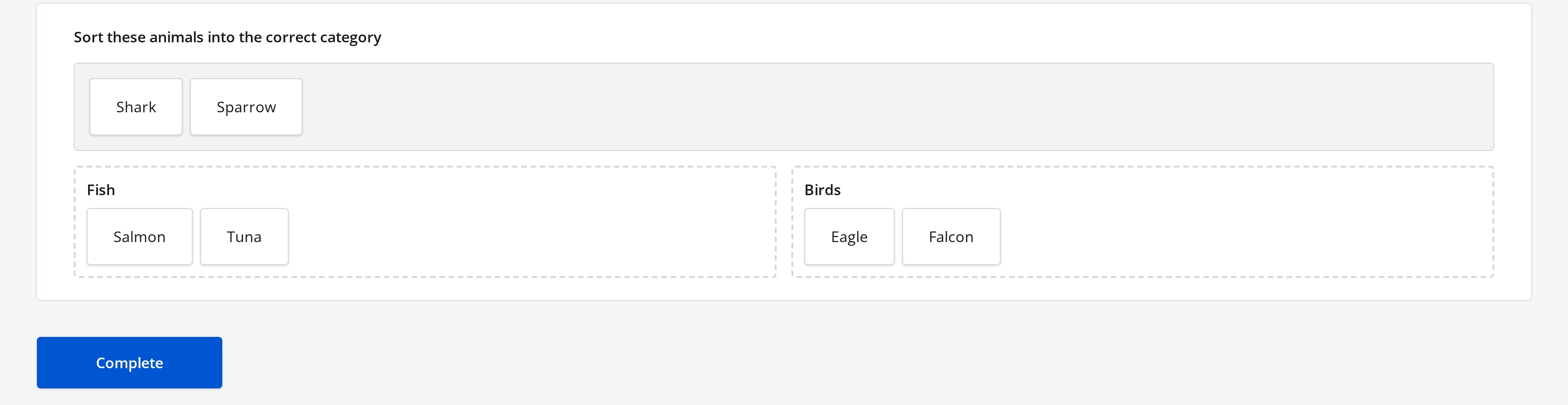
| Drag to Categorize | Items sorted into named zones | A pool of draggable items above a row of drop zones |
Rating Scale
Rating Scale collects one value from a small, fixed set - a satisfaction score, a star rating, a Net Promoter-style number. Its settings live under Rating Values on the Property Grid:
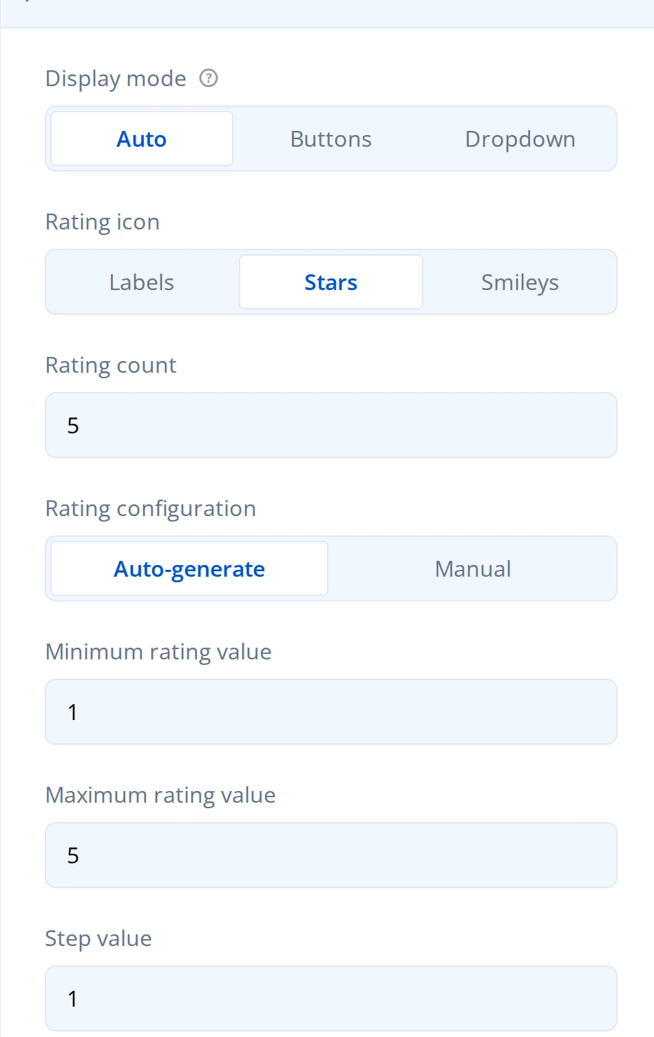
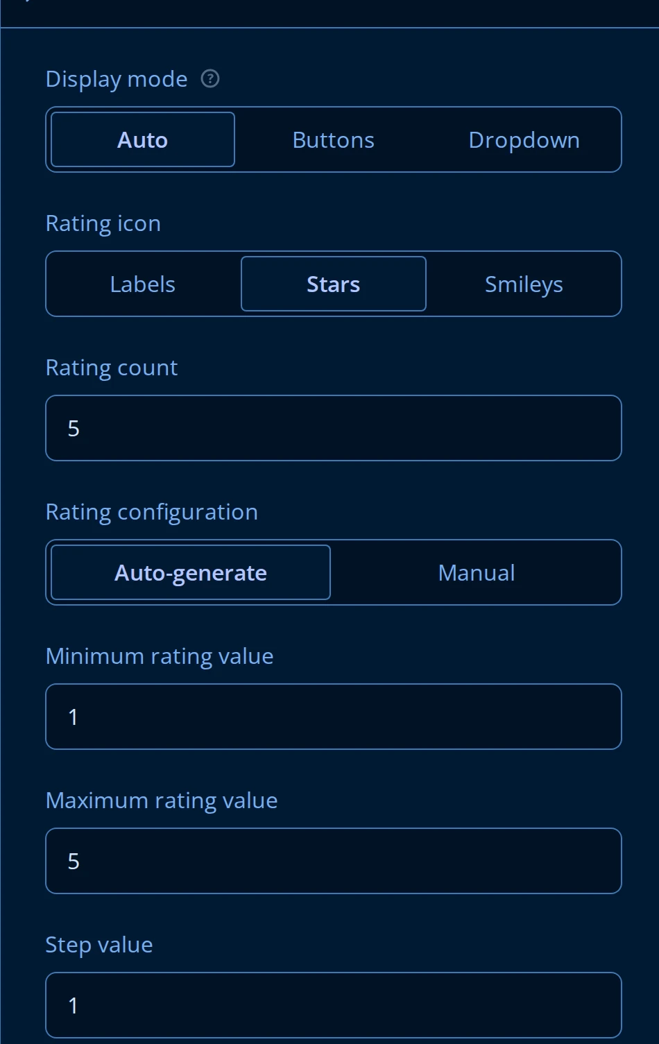
- Display mode chooses between Buttons (a row the respondent clicks), a Dropdown, or Auto, which switches to a dropdown when the buttons would not fit the available width.
- Rating icon switches the row between Labels (numbered buttons, the default), Stars, and Smileys.
- With Rating configuration set to Auto-generate, Minimum rating value, Maximum rating value, and Step value generate the scale for you (1 to 5 by 1, for example). Switch to Manual to type an explicit list of values instead, each with its own display text.
- Minimum value label and Maximum value label (below Step value on the same panel) caption the two ends of the scale - "Not satisfied" and "Very satisfied", for example - without needing a value at every point in between.
Smiley icons add two settings of their own: Rating icon color mode switches the emoji between Monochrome and full Colored rendering, and Smileys color scheme picks between a Default color for the selected emoji or one inherited from its position on the Scale (red at the low end, green at the high end).
Slider
Slider collects a numeric value, or a numeric range, by dragging a handle along a track instead of typing a number or picking from a list. Its settings live under Slider Settings:
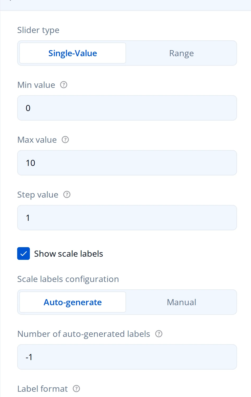
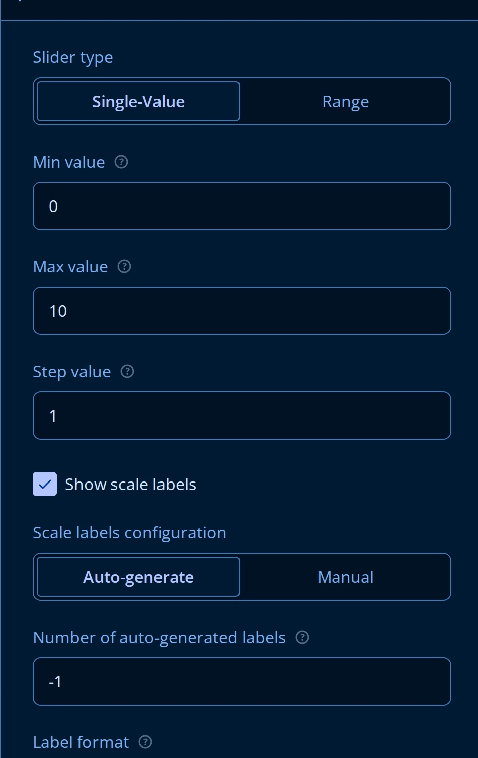
- Slider type is Single-Value (one handle, one stored number) or Range (two handles, and the answer is stored as a
[min, max]pair). - Min value, Max value, and Step value bound the track and the interval between stops.
- Show scale labels draws numbers along the track. Scale labels configuration either Auto-generates them from Number of auto-generated labels (
-1picks a count automatically based on Min value and Max value), or switches to Manual for a typed list of labels at specific values. - Label format accepts a
{0}placeholder for the numeric value - useful for adding a unit, like{0}%or${0}.
Ranking
Ranking asks the respondent to put every choice in order by dragging it, rather than picking one. It reuses the same Choice Options panel as the Choice Questions - editing choices, per-choice logic, and choice order all work the same way there.
Its own setting is Allow selective ranking, on the General tab: turn it on when the respondent should rank only some of the choices, not all of them.
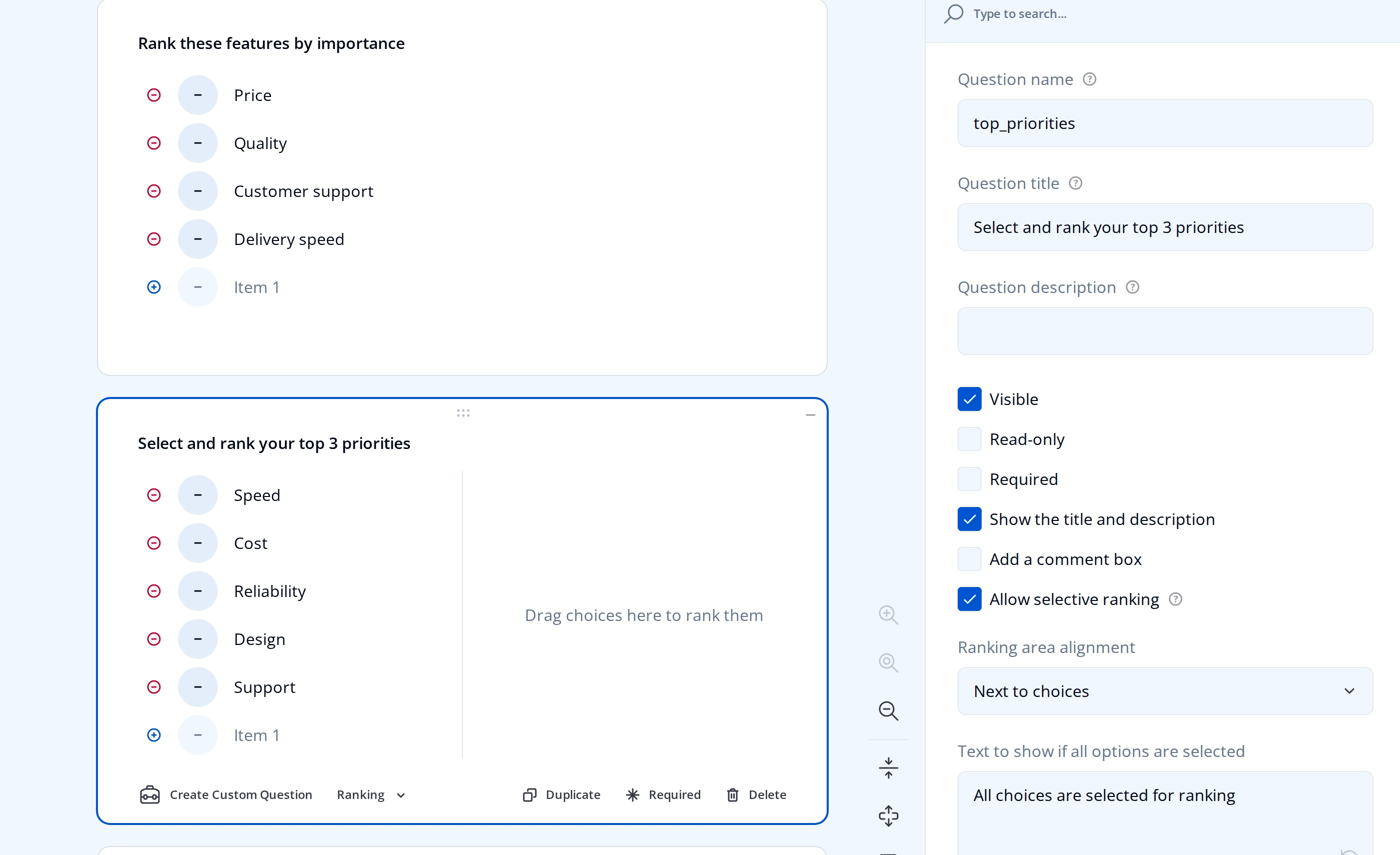
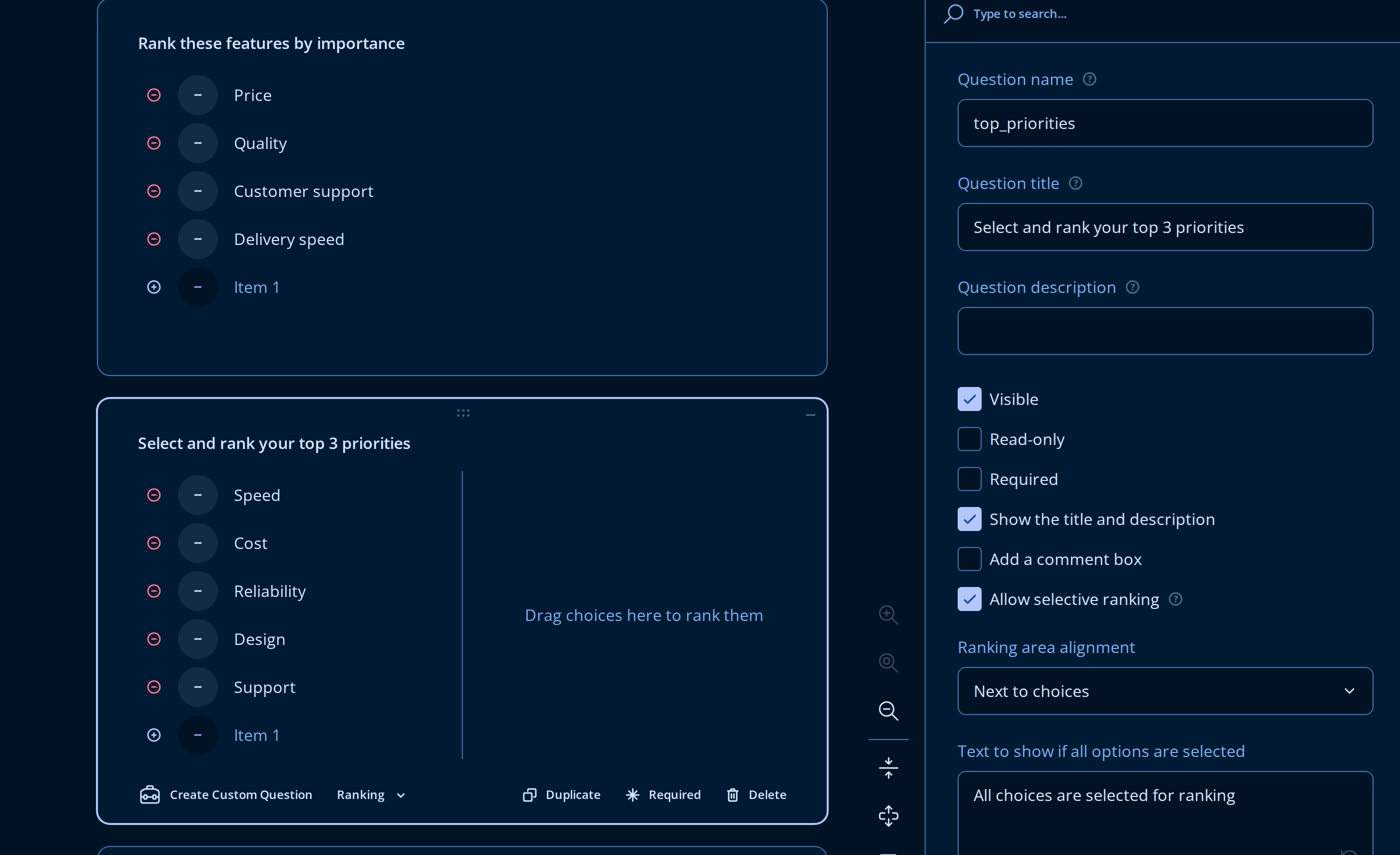
With selective ranking on, the question splits into two areas: an unranked list of every choice, and a ranked area the respondent builds by dragging choices into it. Two more settings appear once it is enabled:
- Ranking area alignment places the ranked area Next to choices (side by side, the default) or Above choices.
- Placeholder text for the ranking area is the prompt shown before the respondent drags anything in ("Drag choices here to rank them" by default). Text to show if all options are selected replaces it once every choice has been ranked and the unranked list is empty.
Without selective ranking, every choice starts in the list and the respondent only reorders it - there is no separate ranked area.
Drag to Categorize
Drag to Categorize asks the respondent to sort a pool of items into two or more named zones - a classification or matching exercise, rather than a single ordered list. It is a drag-and-drop question, not a text answer: the submitted value is each zone's list of items.
Zones and items share the Choice Options panel, below the usual Choices table:
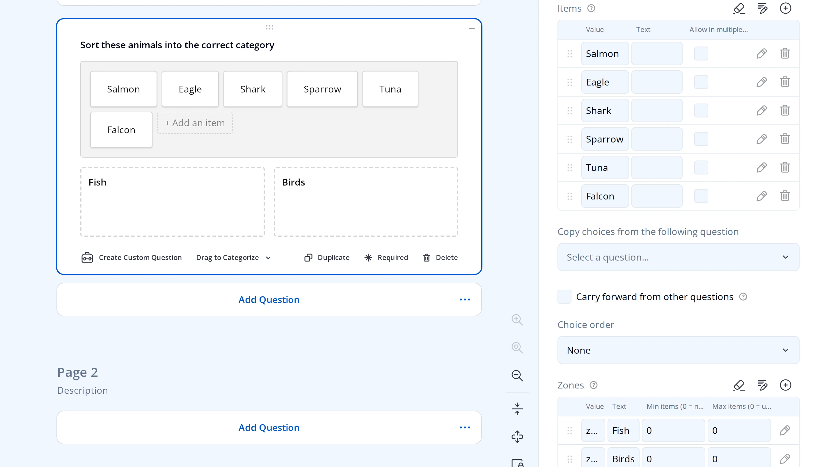
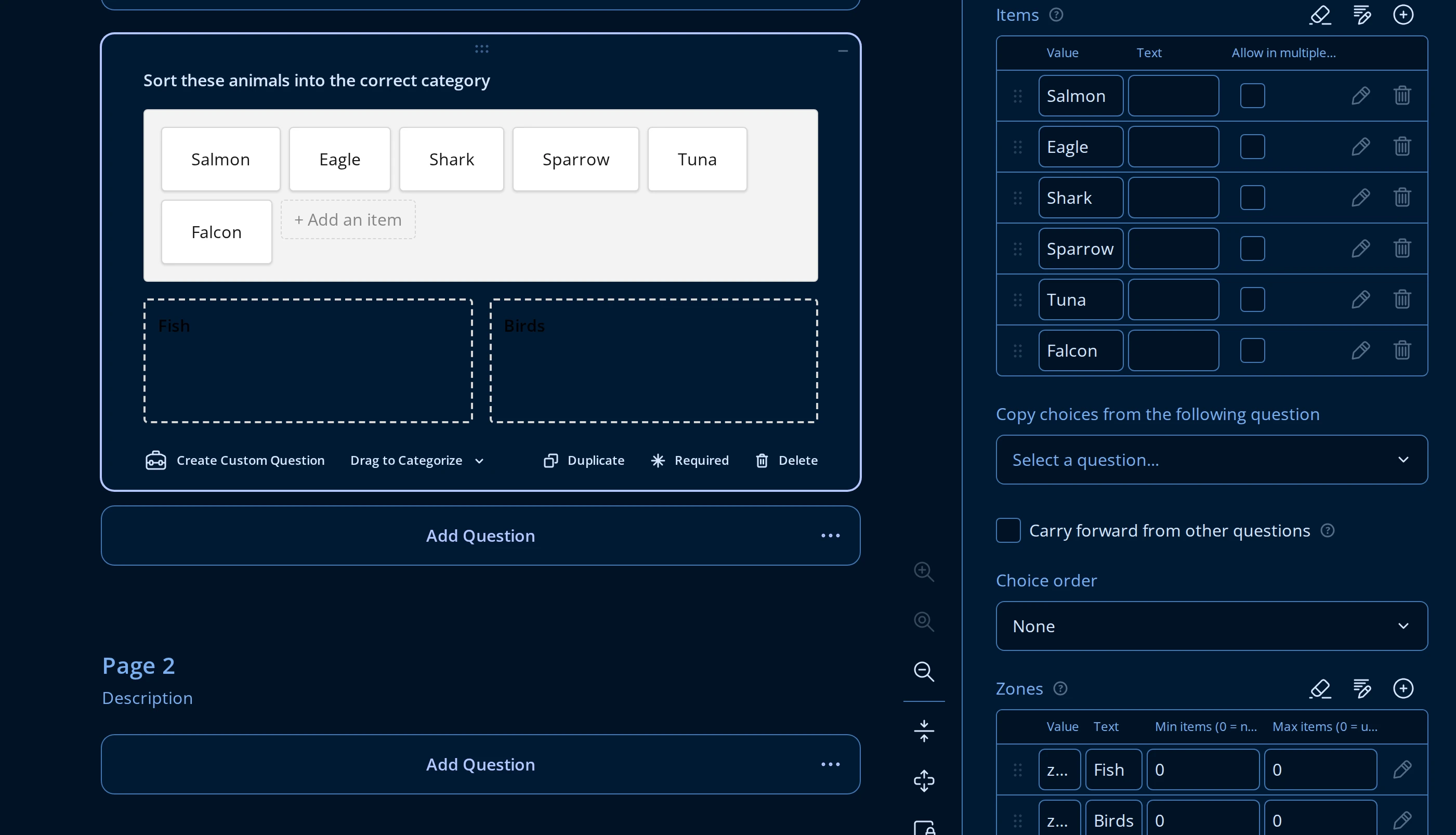
- Items is the draggable pool, edited like any other choice list. Turn on Allow in multiple zones for an item that should copy into a zone instead of moving out of the pool - useful when the same item can belong to more than one category.
- Zones needs at least two rows. Each zone's Min items and Max items cap how many items it can hold (
0means no minimum, or no maximum); the Form Builder blocks deleting a zone once only two are left, since categorizing needs at least that many.
Two more settings live elsewhere on the Property Grid:
- Layout has Zone width (px), the minimum width before zones wrap onto a new row, and Show labels under images for items that carry both an image and a text label.
- Validation has Require all items to be placed, which blocks the respondent from advancing until every pool item has a zone.
What respondents see