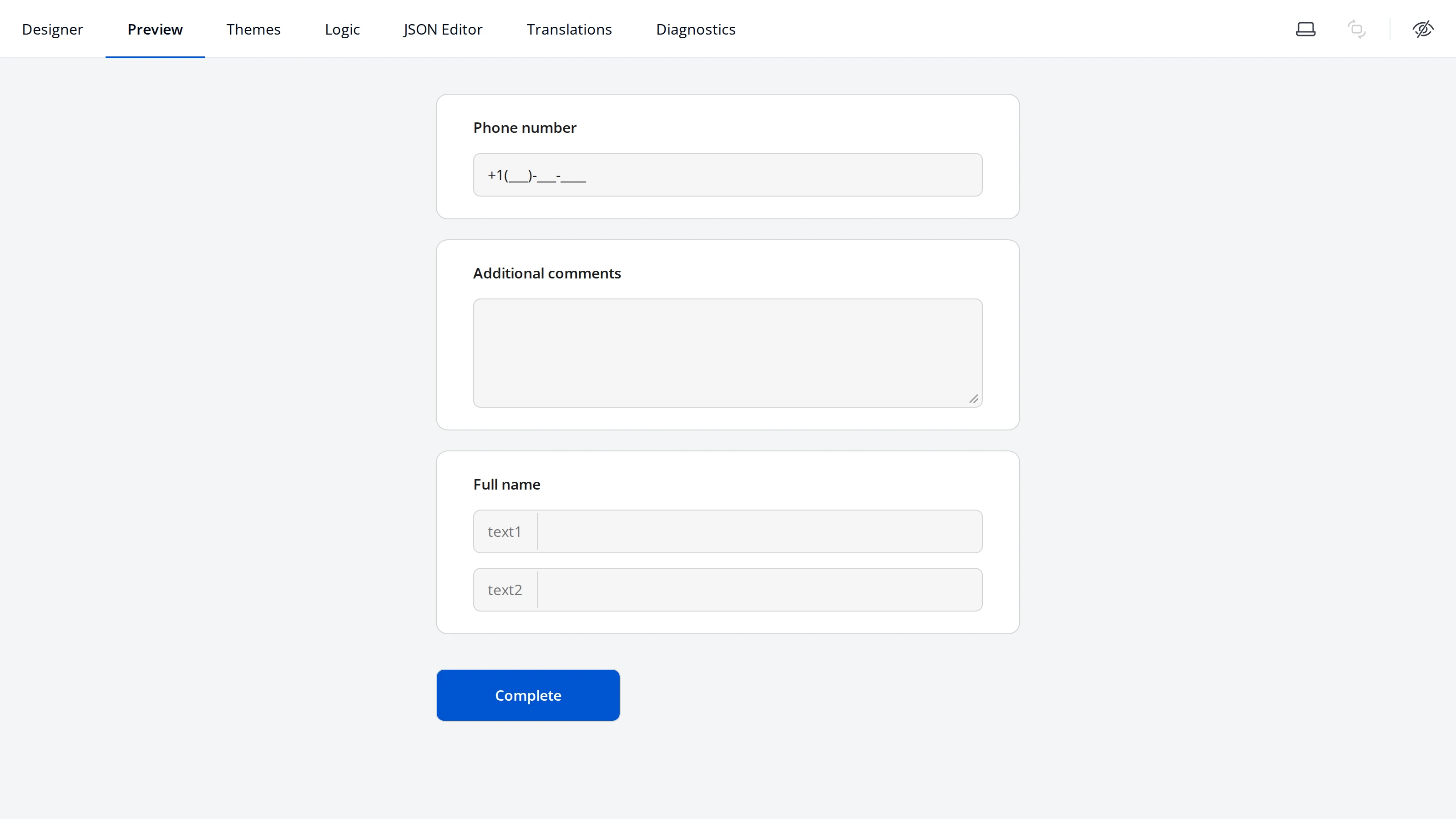
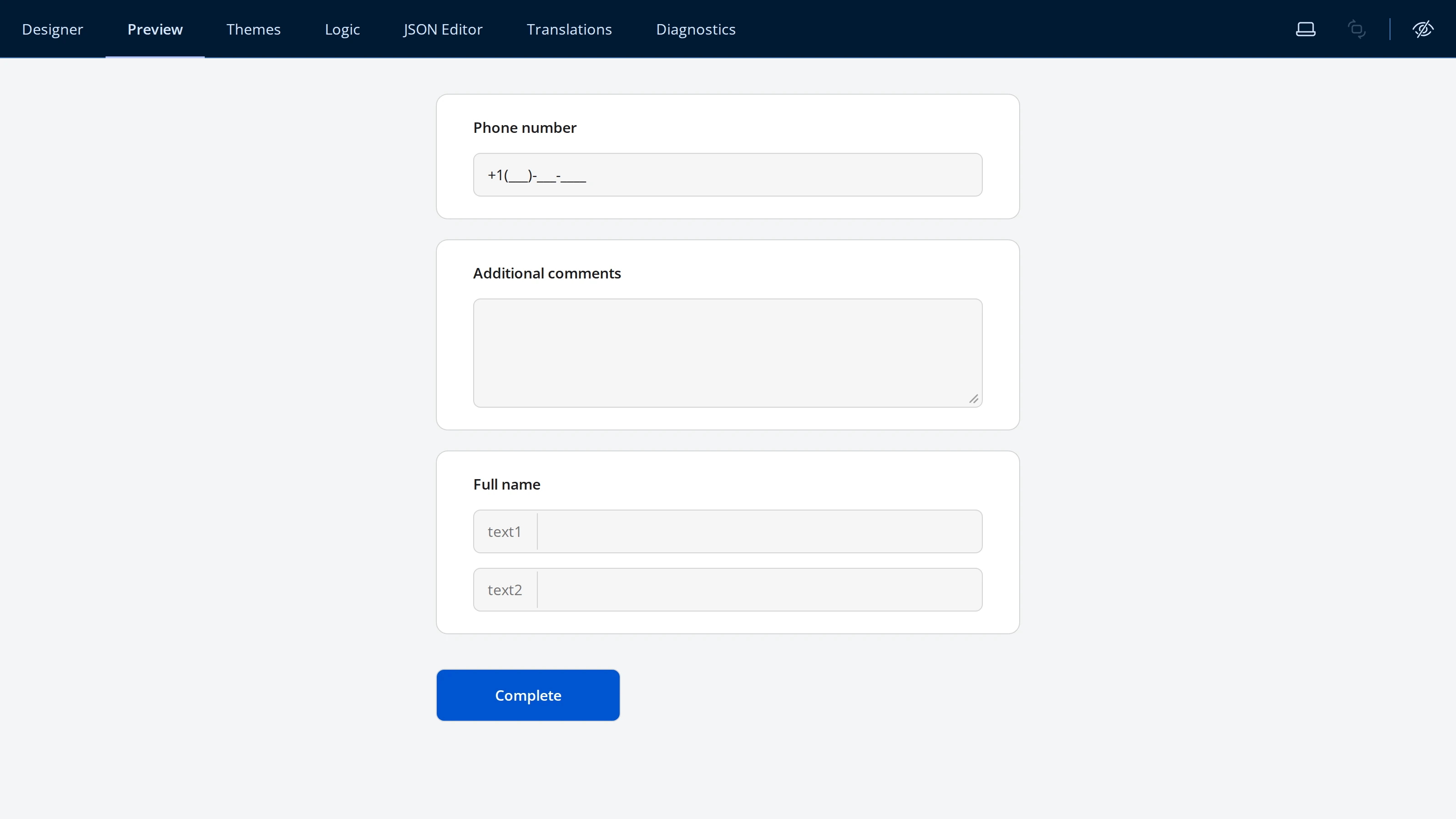
Text Questions
Endatix Hub has three question types for free-text answers: Single-Line Input, Long Text, and Multiple Textboxes. All three live in the Form Builder toolbox and share the same validation system; this page covers what makes each one different - input types, input masks, and layout.
Single-Line Input
Single-Line Input collects one line of text. It's the toolbox default (labeled Text) and also the entry point for a set of specialized inputs: expand the arrow on the Single-Line Input toolbox item to add a question with a different browser input type already selected. Long Text and Multiple Textboxes, the other two question types on this page, sit right below it in the same toolbox.
| Input type | What it renders |
|---|---|
| Text | A plain text field (default) |
| An email field with browser-native format checking | |
| Number | A numeric field with increment/decrement controls |
| Password | A masked field that hides typed characters |
| URL | A field with browser-native URL format checking |
| Phone Number | A tel field - no built-in format checking, pair it with an input mask |
| Date, Month, Week, Time | The browser's native date/month/week/time picker |
| Date and Time | The browser's native date-and-time picker |
| Color | The browser's native color picker |
| Range | A slider between a minimum and maximum value |
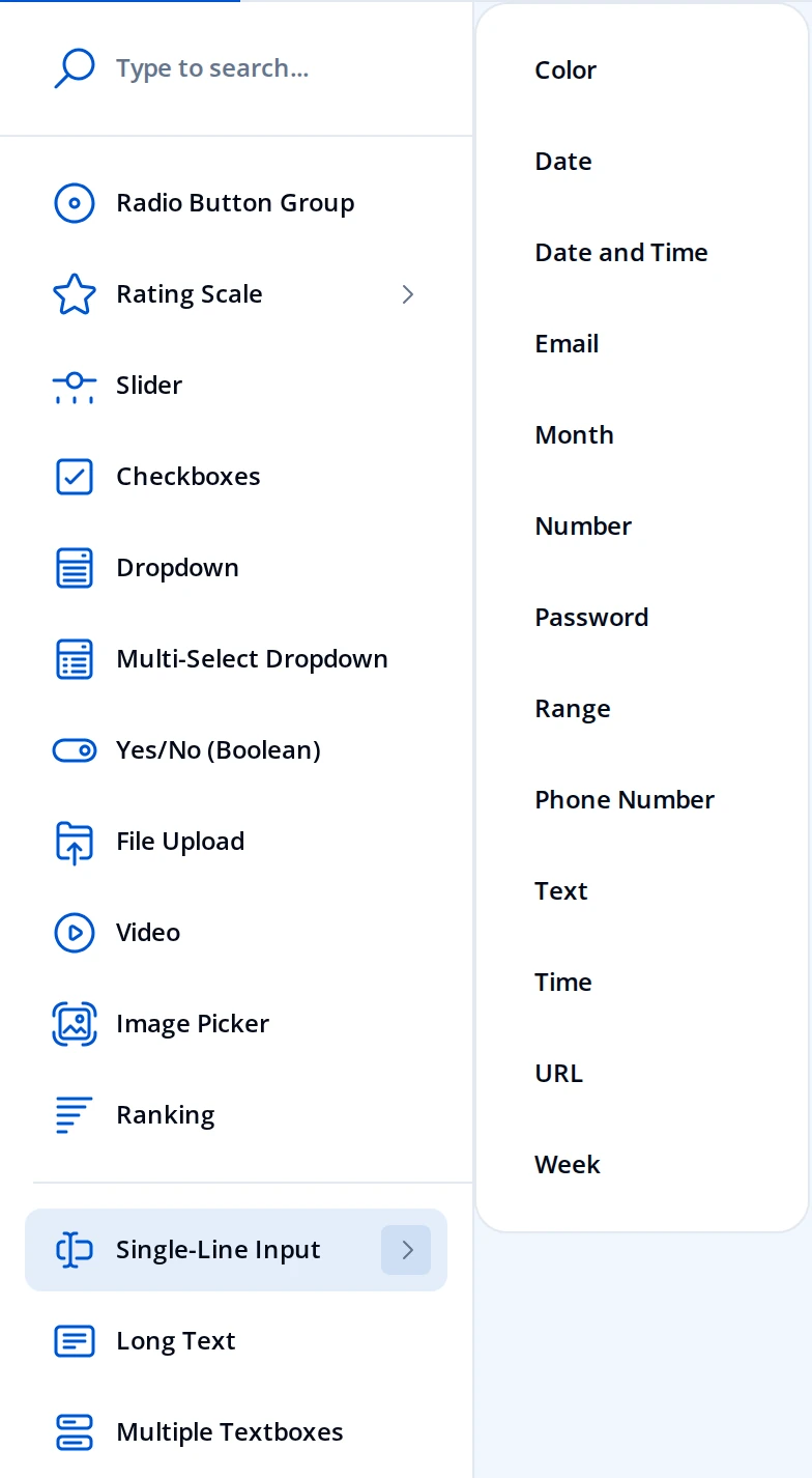
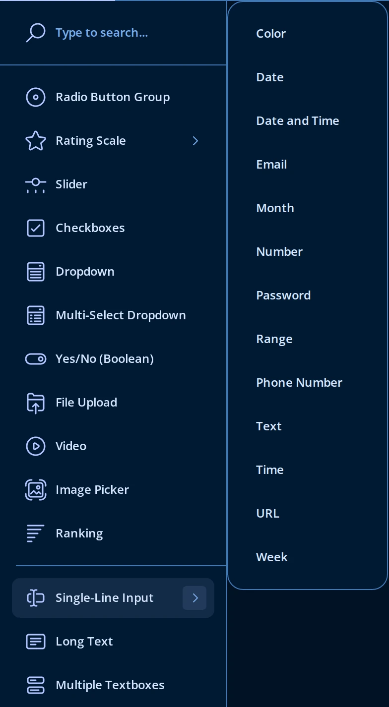
You can also change the type later, from Input type on the General tab of the Property Grid for an existing question. The General tab also has Placeholder text within input field, Autocomplete type (standard browser autofill hints - First Name, Email, Current Password, and dozens more), and Items for auto-suggest, a typed list of values the browser offers while the respondent types.
Input masks
An input mask formats what the respondent types as they type it - useful for phone numbers, reference codes, or amounts where you want a consistent shape without writing a validation regex. Input masks are on the Input Mask Settings tab, and only apply to Single-Line Input (including each field inside a Multiple Textboxes question - see below).
| Input mask type | Settings |
|---|---|
| None | No formatting (default) |
| Pattern | Value pattern - a mask template such as +1(999)-999-9999, where 9 is a digit placeholder |
| Date and Time | Value pattern (for example mm/dd/yyyy HH:MM:ss), Minimum value, Maximum value |
| Numeric | Minimum value, Maximum value, Value precision, Decimal separator, Thousands separator, Allow negative values |
| Currency | Currency prefix and suffix, plus the same minimum, maximum, precision, and separator settings as Numeric |
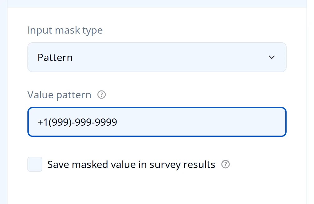
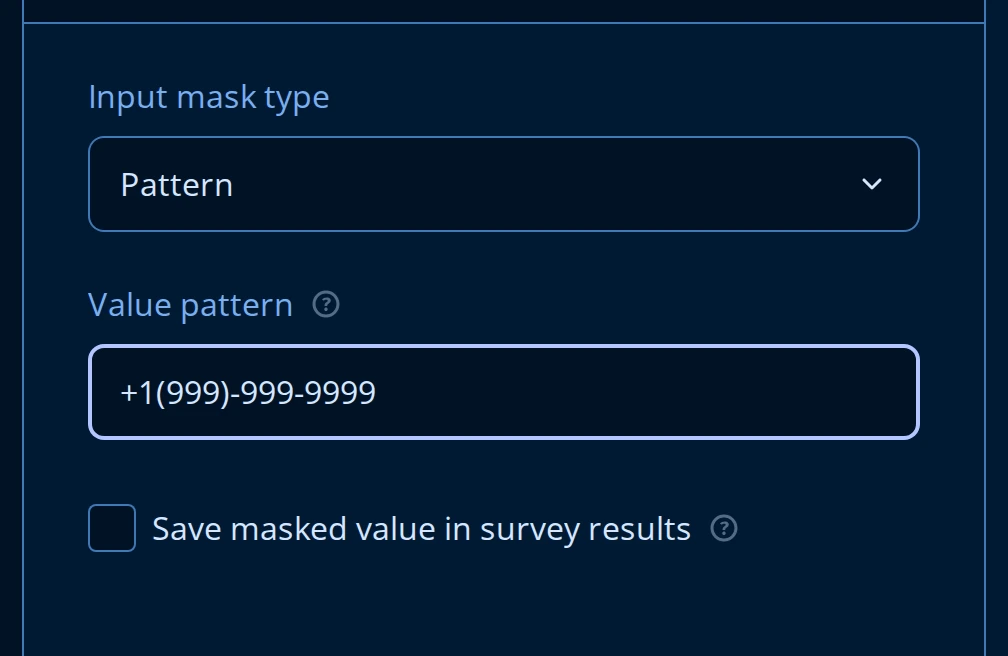
Every mask type has a Save masked value in survey results checkbox. Leave it off to store the respondent's raw input; turn it on to store the formatted value (with the mask's punctuation) instead.
Validation
Mark the question Required on the General tab, and set Maximum character limit on the Validation tab (-1 means no limit). For format rules beyond an input mask - a regular expression, a length or number range, or a rule that compares this answer to another question - add a validation rule on the same tab. Validation rules work the same way across every question type; see Validation for the full reference.
Long Text
Long Text collects a multi-line answer in a resizable textarea - comments, descriptions, free-form feedback. It has the same Question title, Question description, Required, and Placeholder text fields as Single-Line Input, but no Input type or Input Mask Settings tab: Long Text is always plain text. If you need a formatted single line, use Single-Line Input instead.
Its own settings are on the Layout tab:
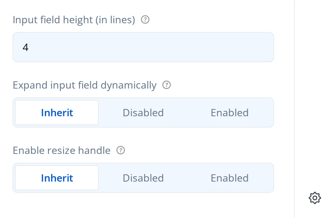
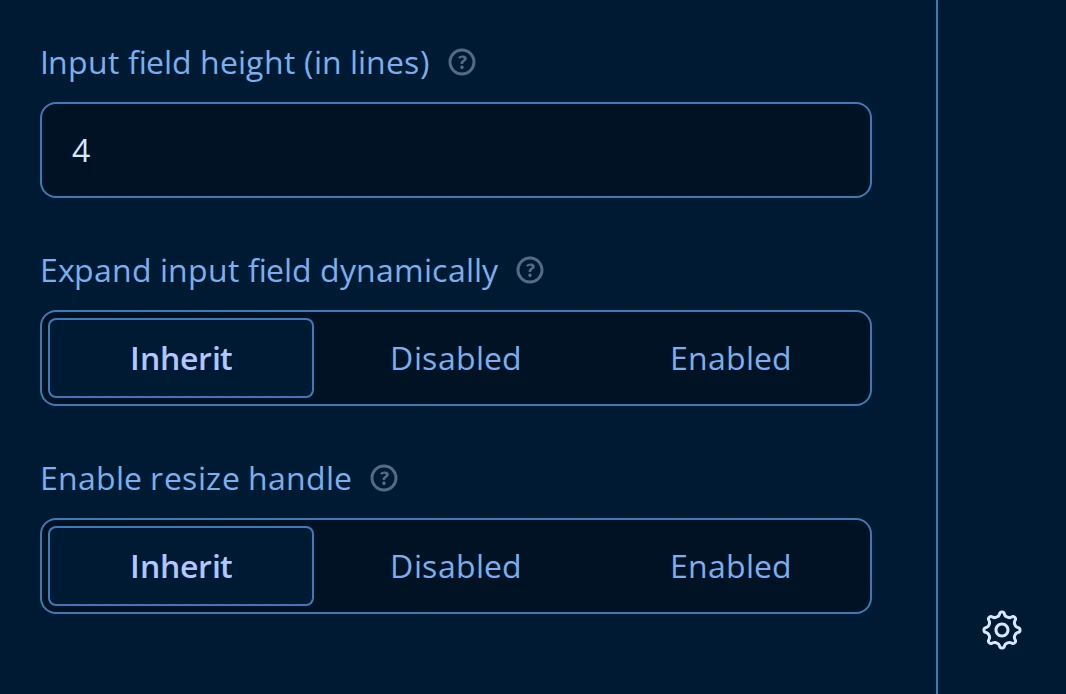
- Input field height (in lines) sets the textarea's starting height (default 4).
- Expand input field dynamically grows the textarea as the respondent types past that height, instead of scrolling inside it.
- Enable resize handle shows or hides the drag handle in the textarea's corner that lets the respondent resize it manually.
Maximum character limit and validation rules on the Validation tab work the same as Single-Line Input.
Multiple Textboxes
Multiple Textboxes groups several named single-line fields under one question - first name and last name, or a set of reference numbers - so they're asked, validated, and stored together instead of as separate questions.
Manage the fields from the Items editor (search "item" in the Property Grid, or reach it from the General tab):

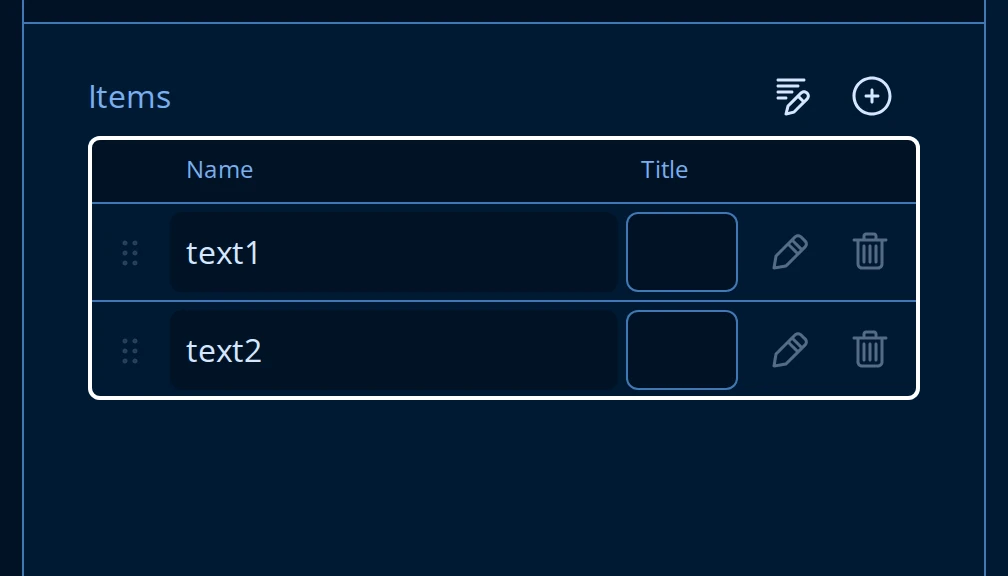
Each row is one field: Name is its identifier in the submitted data, Title is the label shown to the respondent (falls back to the name when left blank). Use the edit (pencil) icon to open a field's own settings, drag the handle to reorder fields, and the + button to add another.
A field's settings mirror Single-Line Input, because each one is a single-line text field in its own right:
- General: Input type (the same Text/Email/Number/Date/… list as above), Required, Input field width (in characters), Placeholder text, and Input value alignment.
- Input Mask Settings: the same Pattern, Date and Time, Numeric, and Currency masks described above - set independently per field.
- Validation: its own Maximum character limit, required-error message, and validation rules.
On the question's own Layout tab, Column count lays the fields out in more than one column instead of stacking them, and Item label width sets a fixed width for the field labels so a grid of fields lines up.
What respondents see